3 Tips For Styling Built-Ins
Shelf styling can always be a bit intimidating. Depending on how many shelves you have, it can be overwhelming on where to start. The biggest piece of advice I can give you is to take your time with it, and trust the process. Sometimes it takes a while to curate the perfect items for one cohesive look and that’s okay! Here are 3 tips I have for styling your built-in shelves:
Add Texture + Height
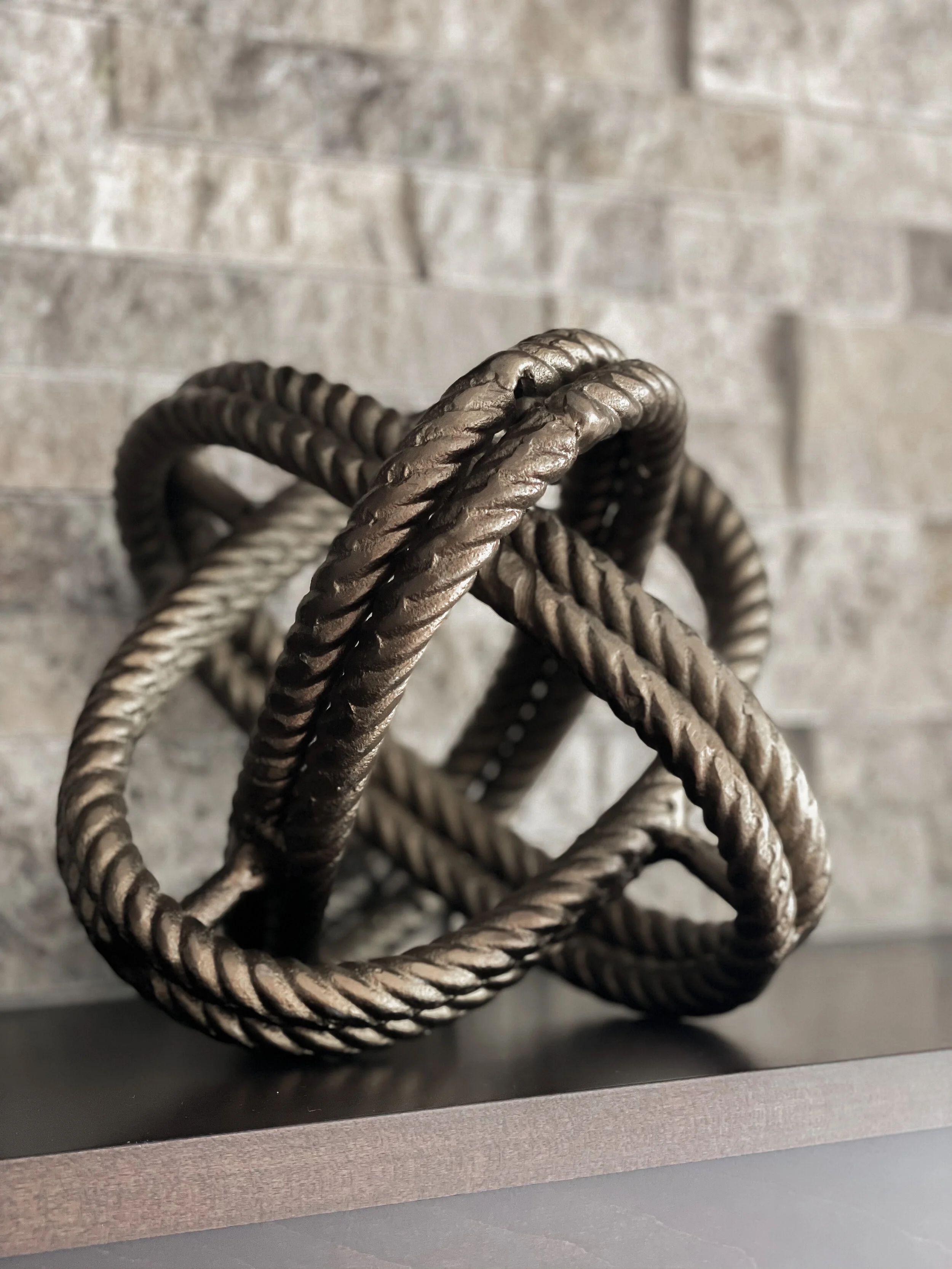
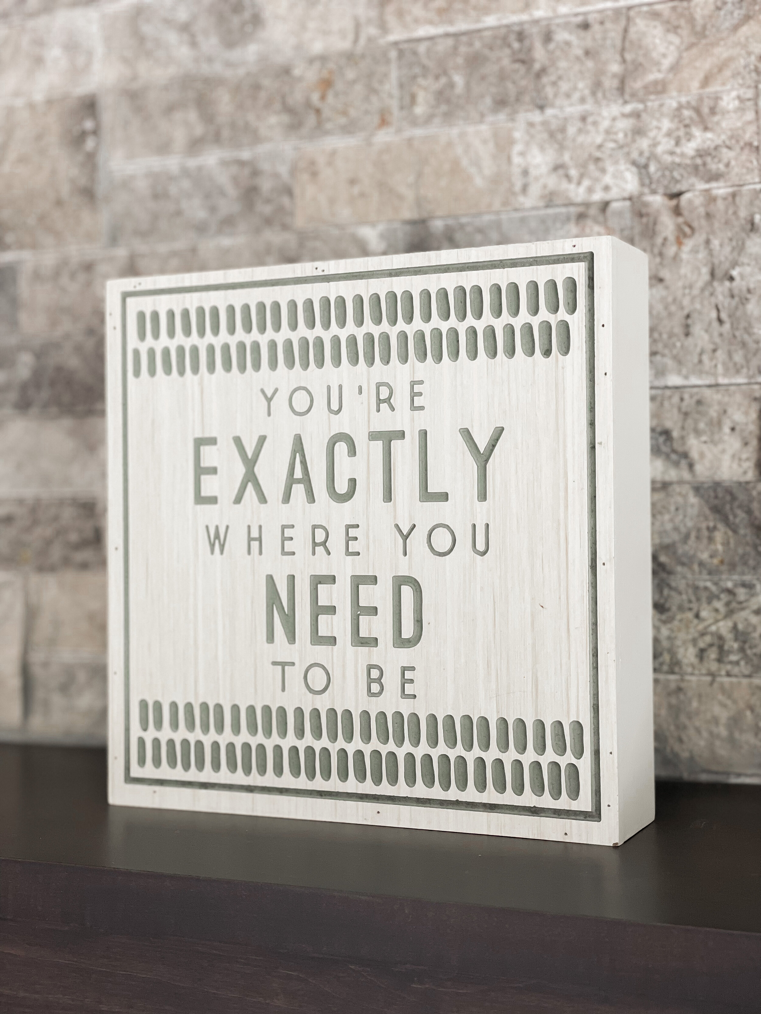
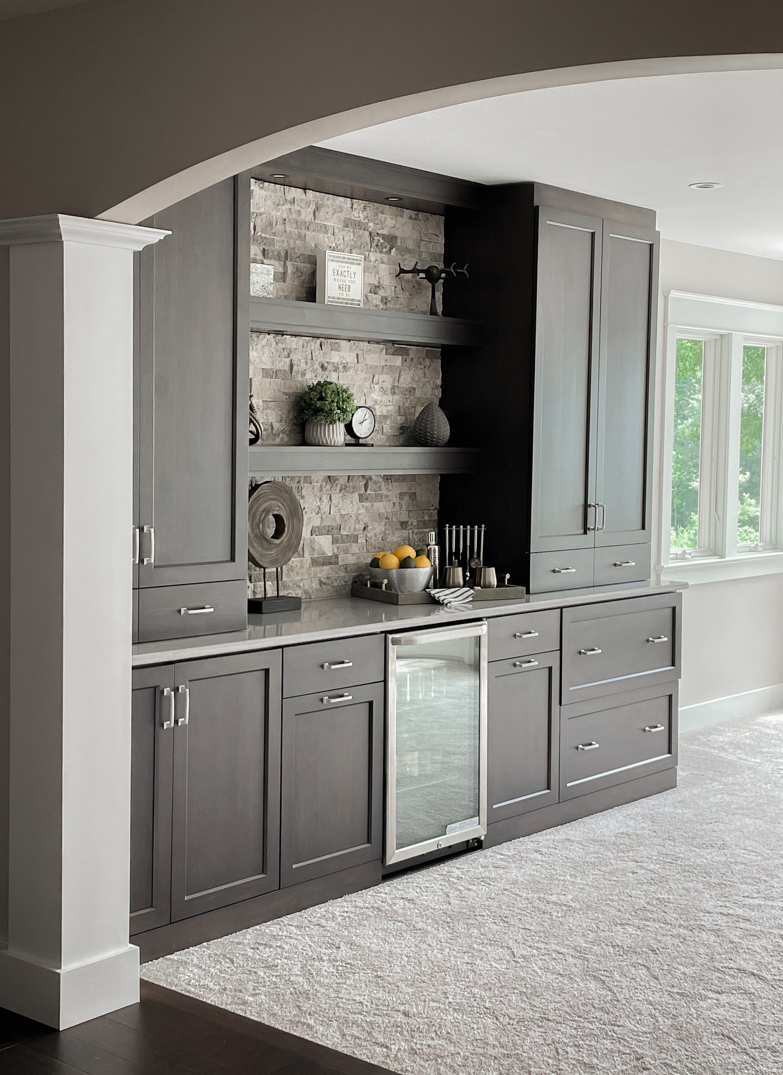
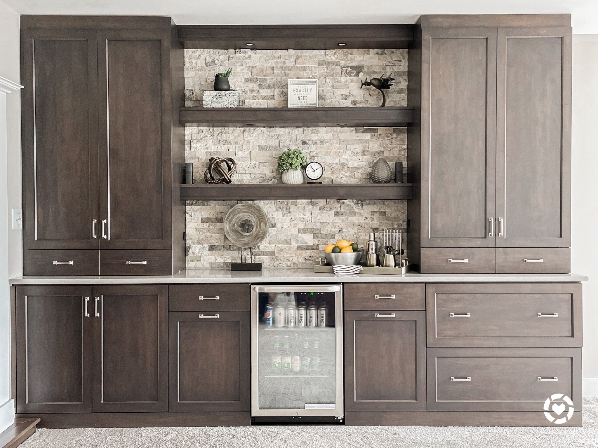
Using different textures adds dimension to the space and visually keeps the eye moving. You’ll see for this design I used wood, metal, aluminum, resin, and concrete as some examples of different textures. To keep the eye moving, I also used varying heights which adds depth and interest to the design.
Mix Metals
Mixing metals really elevates the design with depth and interest. Start small and use two different metals if you are unsure. I used goid and silver for this look which pulls the warmth from the stone as well as the coolness of the countertop and the brushed silver handles on the built-ins. You can mix metals with picture frames, mirrors, and other decorative pieces as well.
Add Character
Adding touches of character that represent you or your family makes the design your own! For instance, this client works on and flies airplanes, so adding a plane to the design was a simple touch that adds character and makes the space feel one of a kind and curated specifically for them. You can add character by using pieces from travel you’ve collected that have meaning to you or family heirlooms that are sentimental. Just be sure to include pieces that still stick to the same color palette that you have chosen so it all remains cohesive and doesn’t feel like you just put things on a shelf. It has to be well thought out and planned to look effortless!
You can shop your screenshot of the picture above with the free LIKEtoKNOW.it shopping app or search Home By Hiliary! http://liketk.it/3jgFq


